

I keep looking at Renoir’s painting La Grenouillère. It gives me holiday vibes. Maybe it’s just the few glimpses of sun we’ve had here in the UK this March – the promise of summer to come. I’ve decided to try something a bit different with this painting study. For a start, I’m thinking I want to recreate it in pen and watercolours. But what if I pick out a limited selection of hues – and see what happens if I build up the layers of colour one by one? I’m intrigued just thinking about it. In this post, l share each step and my thoughts during the process.
Background on Renoir and the ‘La Grenouillère’ painting
Pierre-Auguste Renoir (1841-1919) was a French Impressionist artist, known for his portrait paintings (see my previous blog where I study Renoir’s ‘Two Sisters’ painting). Google tells me that Renoir painted at least two ‘La Grenouillère’ scenes – but the one I am looking at today is his most famous version which resides in the Nationalmuseum in Stockholm.
One thing I find quite cosy about the Impressionist painters is that they sometimes worked alongside each other, resulting in very similar paintings – or at least, similar in terms of the scene depicted. In the case of ‘La Grenouillère’ (a popular leisure spot on the Seine River), Renoir painted this scene alongside Monet in 1869 ‘en plein air’. This means it was painted outside, which came to be one of the defining features of the Impressionism art movement. Monet’s painting resides in the Metropolitan Museum of Art in New York City.
It is clear that Renoir’s painting focuses on the people, whereas Monet’s painting focuses on the water. This is not surprising given Renoir’s fondness for portraits and Monet’s fondness for nature (think water lilies). I like both, but I prefer Renoir’s in this instance. The colours are softer and warmer, the brush strokes also seem softer and more joyful. I guess Renoir was aiming to highlight the lively social interactions and Monet was more interested in capturing nature.
Fun fact: apparently ‘La Grenouillère’ translates to ‘the frog pond’ which I find very apt considering my unexplainable desire to paint frogs over the last two years.
Colours
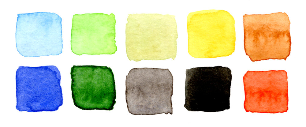
If you’ve been on my blog before, you might know that I like to pick out the “top ten” colours in a painting. I find that it really helps the analysis if I break things down into a few main colours – helps to provide some initial focus.
I decided to do this in acrylics (as I usually do), because I find mixing and matching colours with acrylic paints is easier than watercolours. And besides, I’m only really using this first step as a guide – I’ll choose the colours first and then each colour will be used for each layer of paint. I’ll have ten layers of paint to apply, which means I’ll have to recreate them (as best as I can) in watercolour anyway.
These are the colours that I found in Renoir’s ‘La Grenouillère’ painting:
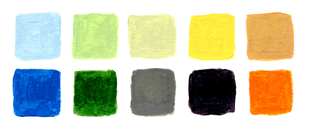
It’s often surprising and not immediately obvious what the main colours are going to be. All in, I think this is a really lovely set of colours. Subtle and pleasing.
Side note: I don’t keep a well-structured mixing palette (ever), I can’t say it bothers me:
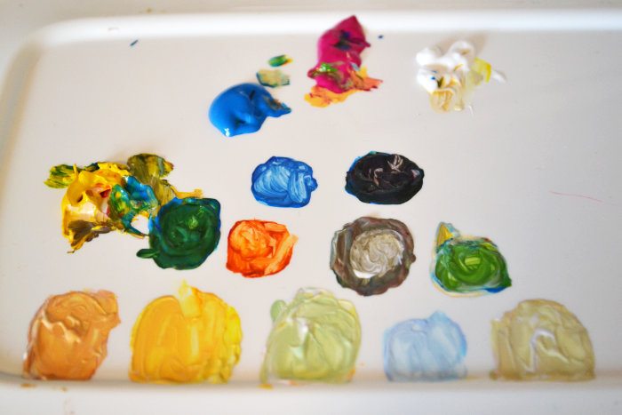
Let your palette evolve naturally, however you want it to!
The Watercolour Study
With Sibelius’ Symphony No. 3 playing in the background, I reached for my pens and paper, and made a start on a sketchy outline.
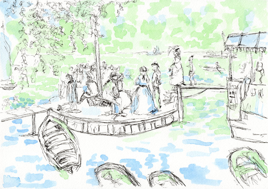
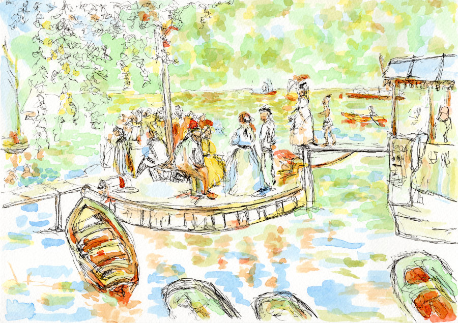
I’m using an A4 sized sheet of watercolour paper and a 0.2mm Uni Pin Fineliner, because I know with these pens that the ink won’t bleed when I start applying the paint later. This is my starting point:
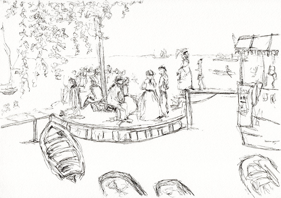
At this point, I wasn’t sure whether I would add more pen later on – but I was happy enough with the drawing to get me going with the watercolours.
With no time to waste, it was on to layer one. I decided that I might as well follow the same order from my “top ten” acrylic paint swatch, starting with the pale blue in the top left and working my way round clockwise.
And I still wanted to stay true to the Impressionist ideals of emphasising light and movement, so I figured that a medium-sized round brush would help achieve this.
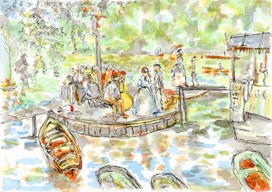
This is after the first layer:
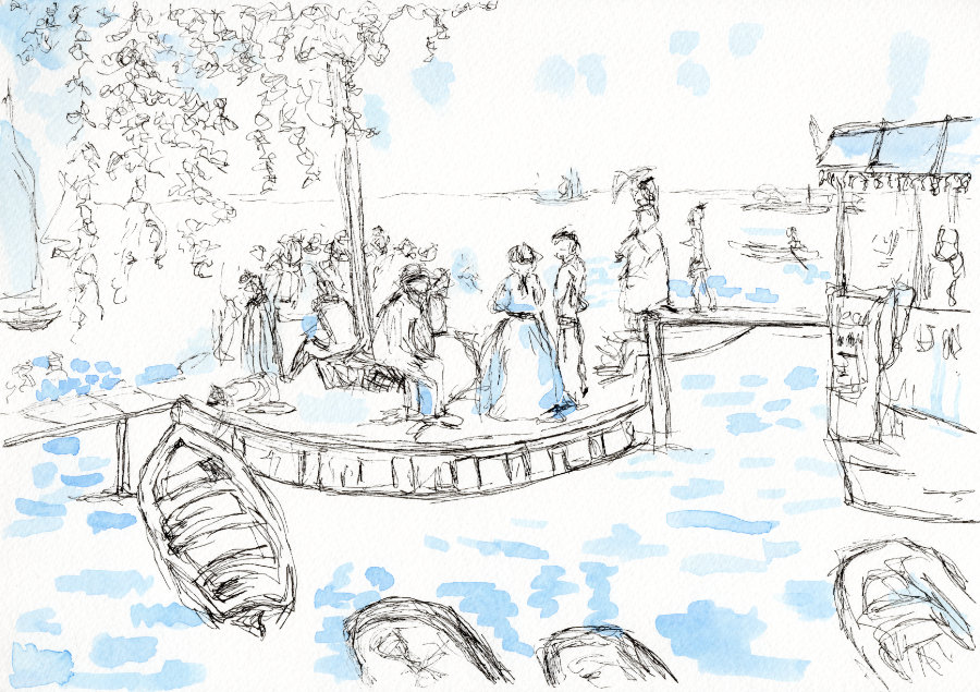
I don’t dislike it as much as I thought I would at this point (such early stages Ruth… I’m my worst critic!). The Sibelius symphony had finished, and as much as I could listen to that symphony on repeat, I decided to go practice violin while I waited for the blue to dry.
It would be very easy to ‘overwork’ each layer. I tried very hard to avoid this – less I end up with a flat, bland, painty mess and a sad face. I was conscious that I wanted to have lots of contrast by the end of the study.
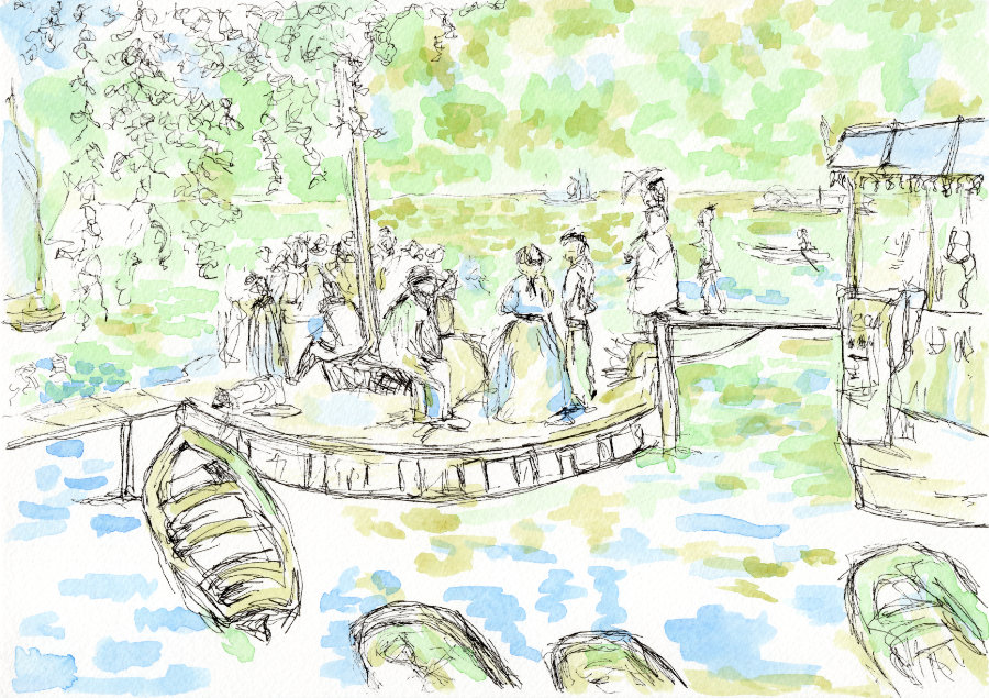
When applying the second layer – the pale green – I realised that I would have to continue this exercise by always thinking a few steps ahead. Particularly in terms of what colours I wanted to be underneath future layers. The painting equivalent to a game of chess.
It’s possible that I have rather ironically underworked the blue in layer one out of fear of overworking it. Never mind!
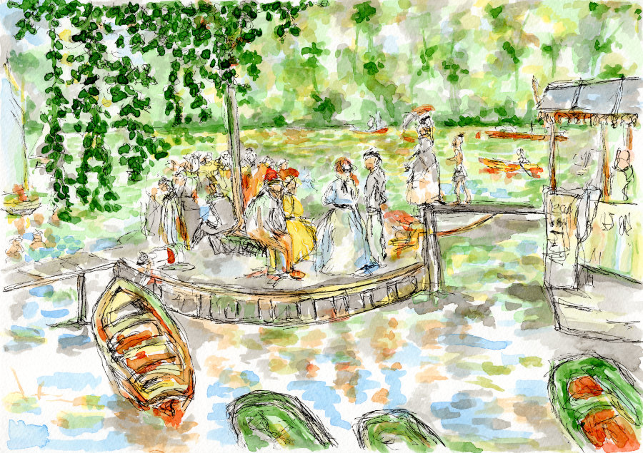
I left layer two in the sun to dry and took a short meditation break:
Layer three was more of a sage green colour. At this point I realised the painting was lacking definition and looking quite ‘flat’. But I wasn’t too worried as these first three colours have a similar tone – I’d be able to add more contrast with some of the darker colours in future layers.
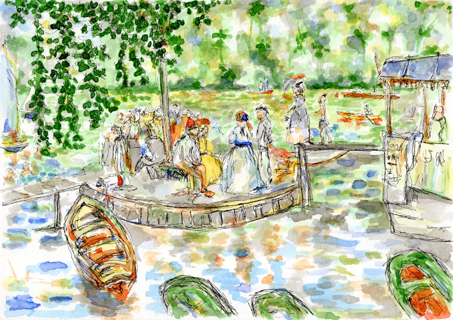
Here is layer three, enough time to make a cup of tea while I let it dry:
Need to be careful not to dip my paintbrush into my cup of tea. I always put my tea next to my water jar because I like to live life on the edge.
Layer four was the yellow layer – I was looking forward to this layer to bring some warmth. It’d be very easy for me to go over the top with yellow paint. But I think I controlled myself fairly well this time:
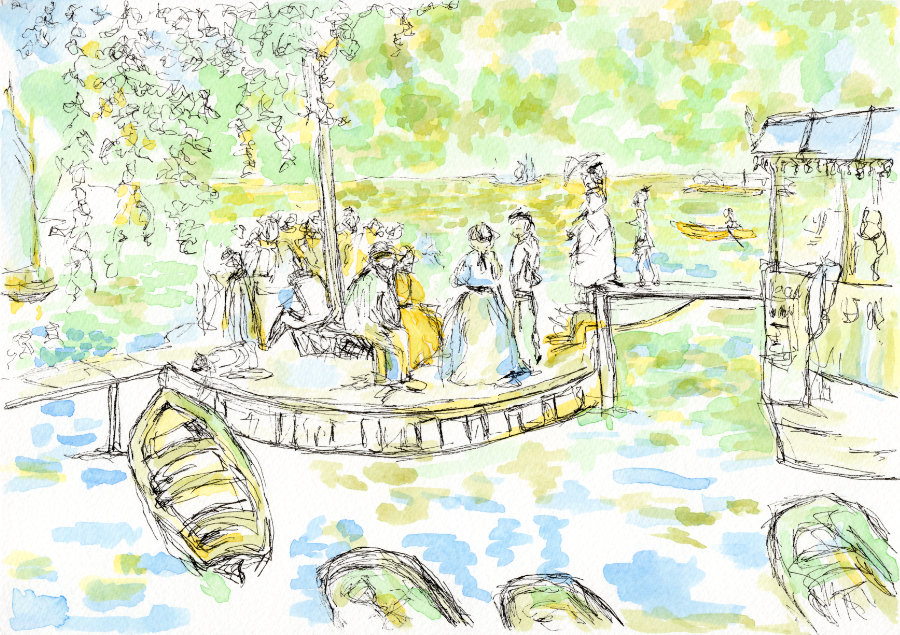
After I’d applied layer five, the paler orange, I was starting to see a ‘dappled’ light effect which I was pleased with. Hopefully suggestive of Renoir’s style, albeit in watercolours rather than oils, and done with far less precision or skill.
For the sixth layer, the orange, I didn’t apply too much paint. Just a few key highlights to support the paler orange:
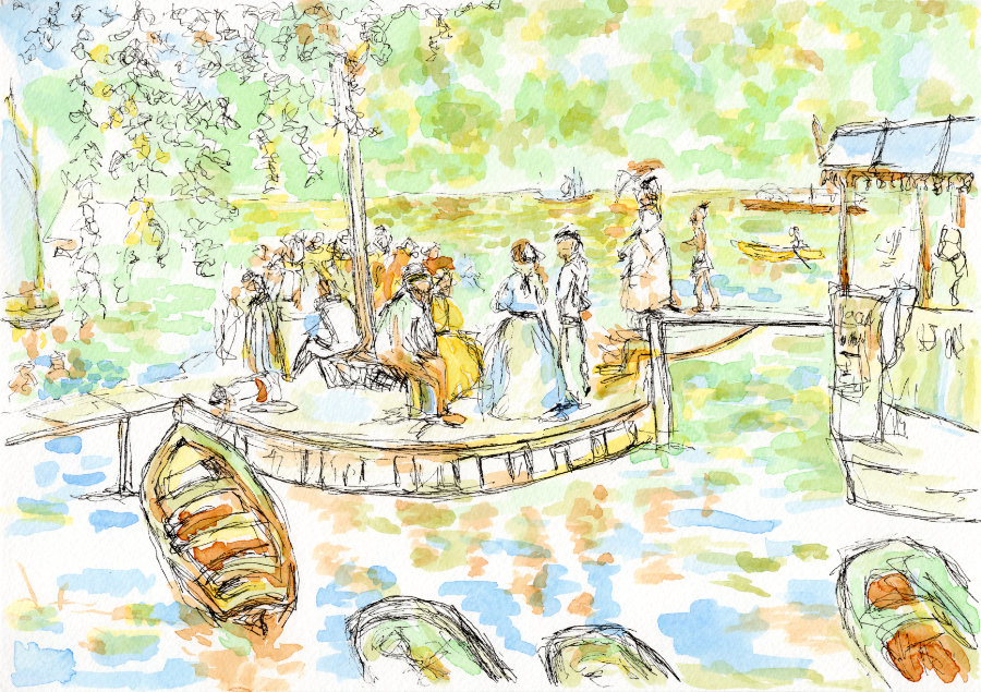
I decided to skip over the black and continue with the next colour, the grey. Something was telling me that I needed to save the darkest colour until last.
I applied the grey quite extensively. Again, it’s still fairly ‘flat’ at this stage but I decided to trust the process:
The next colour was the darker green, and this allowed me to achieve some better contrast – at last. This is most noticeable on the large tree with the leaves framing the top left of the painting.
The penultimate colour was the royal blue which brings out the orange hues quite nicely:
Then the final layer of paint, the black, which gives the most significant transformation. This layer provided the contrast that I was hoping for, and I was glad that I left it until last. I decided against adding more pen – it didn’t need it.
Here it is – the finished watercolour study:
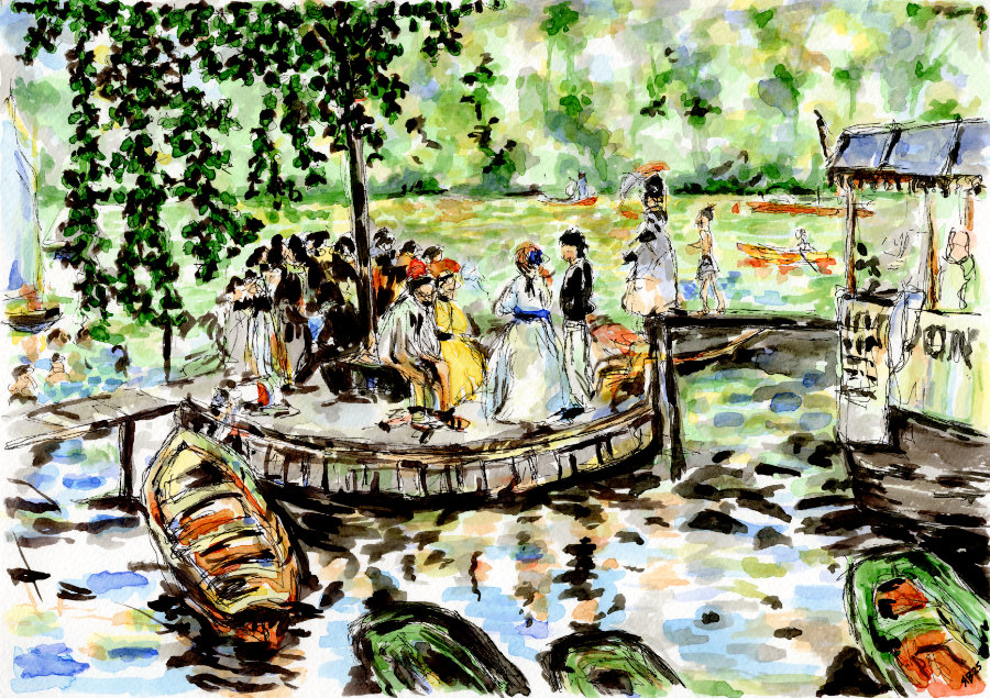
And this is my watercolour equivalent of the “top ten”:
Compare to the acrylics (from earlier in this post) – so I got quite close:
What I Learnt
- Sometimes, an artwork can come together at the last moment.
- It’s possible to use a lot of black or dark colours as long as you have enough white or light colours.
I really enjoyed watching the layers of paint build up and overlap to create new shades.
Is it perfect? No. Do I love it? Yes! And I loved the process, I’ve never painted anything following that kind of structured method before. And I think continuing to practice in this way would help me to develop valuable skills regarding thoughtful paint application.
I would recommend you give it a try with a painting that resonates with you. If nothing else, you’ll ‘get to know’ that painting – I feel quite well acquainted with Renoir’s ‘La Grenouillère’ now!
That’s all I’ve got to share with you today, let’s see what April brings.
Be kind to yourself, and take care.