

This month I’ve been exploring Brusho powders and how they can enhance pen and watercolour paintings. I use Brusho a lot in my mixed media artwork (see my last post where I use it to create artwork inspired by my garden). By the way, this is not a sponsored post – I’m just having a play and showing you the results. I’ve got a few sketchy paintings ready to share with you.
What is Brusho?
Brusho paint powders are created by Colourcraft, a family run business based in Sheffield – and their website describes them as “highly pigmented water-colour crystals”. It is activated when it comes into contact with water – and they advise spraying water to a surface, sprinkling on the powder, and then spraying again if desired. The result is vibrant, random, bursts of colour.
You get a different result every time – it’s a lot of fun. A good ‘pick me up’ activity.
I bought some more colours
Up until very recently, I had 12 twelve colours from one of their starter packs.
But as I was experimenting, I realised that things could probably get a lot more exciting if I had some new colours. One thing led to another, and before I knew it six more pots of Brusho had arrived. Let me introduce you:
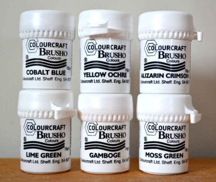
And they look like this…
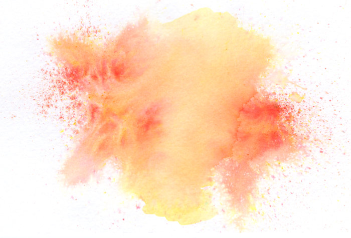
Gamboge – this is a very deep yellow, but I like how it’s possible to achieve orange and almost red by limiting the amount of water sprayed. I can see me using this one a lot to blend warm colours together:
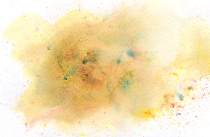
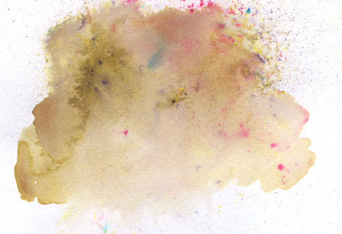
Yellow Ochre – a classic in my colour palette. What I was surprised about was the variety of other colours that appeared here. I can see some bluey-greens, pinks and purples – but I quite like that:
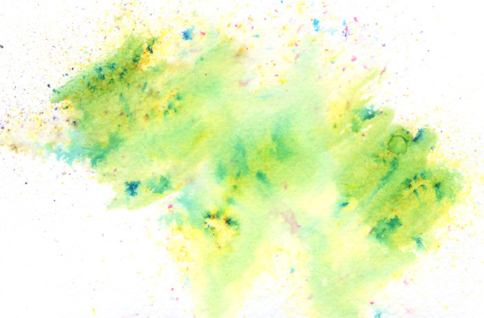
Lime Green – like the Yellow Ochre, this had some surprising variety, there is definitely some pink and blue mixed in but it gives it an appealing randomness:
Moss Green – more unexpected variety here too, with pink and blue making their way into the pot. This is a nice, subtle green-brown that looks more natural than some of the other colours:
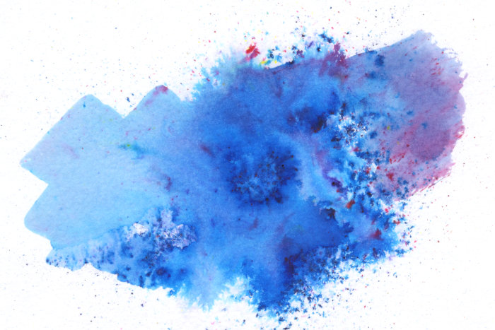
Cobalt Blue – I was really happy with this one, as the 12 original colours I had didn’t have a ‘blue enough’ blue in it for me, the closest was Turquoise. This is exactly the blue I was hoping for:
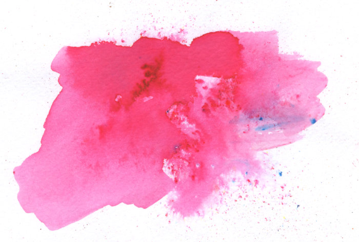
Alizarin Crimson – like the blue, I felt my original set of colours was lacking pink, and again this is exactly what I was hoping for, a nice warm pink:
The Painting Process
Some of these paintings are more successful than others, so please don’t judge me on the quality of the artwork! I was just interested in seeing if I could turn a ‘Brusho background’ into a picture.
The process was largely the same for each one. I don’t tend to wet the page first as suggested – I like sprinkling the powder on and then spraying with water. It’s hard not to get carried away, and I think I used too much water sometimes. I’ve learnt for next time.
After the background dried, I sketched out the subject very loosely. Then I used a brush and some watercolours to soften and blend certain areas or to try create some contrast. Just playing really.
When that dried, I went back to add more pen where I thought it was needed.
Scribbly Sketchy Art
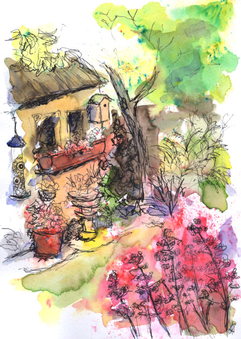
This garden scene is quite loud, but I’m quite happy with how the shed and birdhouse turned out. It’s quirky:
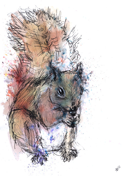
This next one is of a squirrel. I didn’t know it was going to be a squirrel, but the background formed and dried in a squirrelly shape, and so I drew a scribbly little squirrel over the top. It’s based on one that I saw on a recent day out at a local country park:
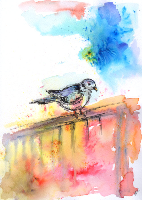
The other day, I looked out the kitchen window and I saw this scruffy, fluffy wood pigeon sitting on the fence. It stayed there for a long time and I wondered if something was wrong with it. But it kept preening itself and stretching, and looking around as if it was confused by everything.
And then it occurred to me that this might be a brand new pigeon.
Which could be possible – Google tells me that it takes around two months for pigeons to grow their adult plumage after hatching, and that pigeons nest from February to September.
Either way, I wanted to draw a brand new pigeon, so here is one:
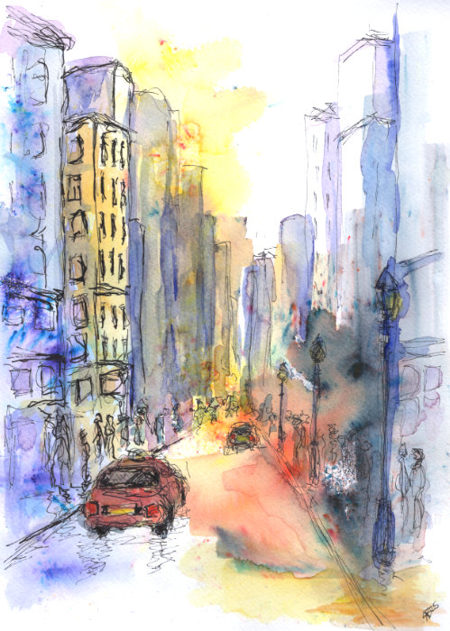
This next one is my favourite because it’s quite atmospheric. It’s a made-up city street scene with less Brusho and more watercolour – this is more of an urban sketch style:
Wait… who’s that?
Oh. This was completely unexpected by the way. But as I was doing my experiments, a couple of companions showed up…
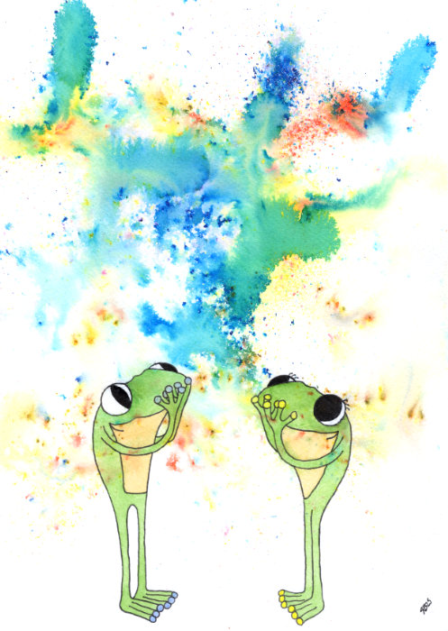
It’s Frog and Frog from Frog’s Bucket List! They got Brusho all over them, but I don’t think they noticed. Looks like they enjoyed the colour show anyway!
Final Thoughts
If you get chance, I would definitely recommend getting some Brusho powders and having a go. I think you could even have a lot of fun with just one pot of colour and a pen. Which has given me an idea… (so many ideas, so little time!).
Until next time, be kind to yourself and keep making art.