
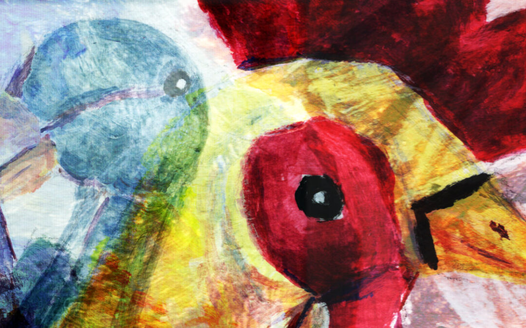
My Garden Friends
My garden bird friends tend to appear at pivotal moments. They are sedentary creatures, happy chilling amongst themselves in my garden. They move around from time to time but are generally content to stay in the same place for months on end. Just observing the wildlife, soaking in the nature. Sometimes momentarily repurposing themselves as a perch for a little robin or sparrow.
I think they are appealing and make for interesting portrait models. They’ve inspired some of my previous blog art.
Making an arty start
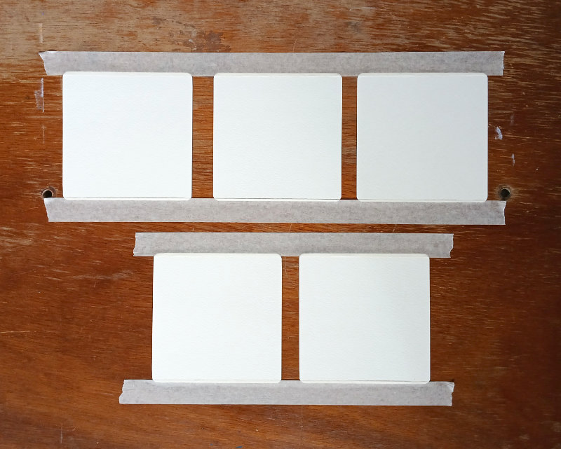
I set up one of my wooden art boards with five small pieces of square watercolour paper:
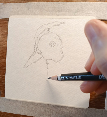
And then, using a Derwent Graphic 4B pencil, I started to sketch the outlines for my bird portrait paintings. Here’s me drawing Plucky:
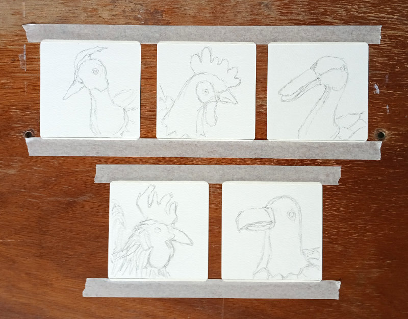
These are the initial sketches for all five birds:
Choosing the acrylic paints
Over the years, I’ve found that I like to stick to a limited palette. I think it helps create cohesion in a painting (or in this case, a miniseries of five paintings). This time was no different, but I didn’t make it too difficult for myself. I chose three primary colours and white.
Here’s my paint palette, freshly prepared for a new painting!
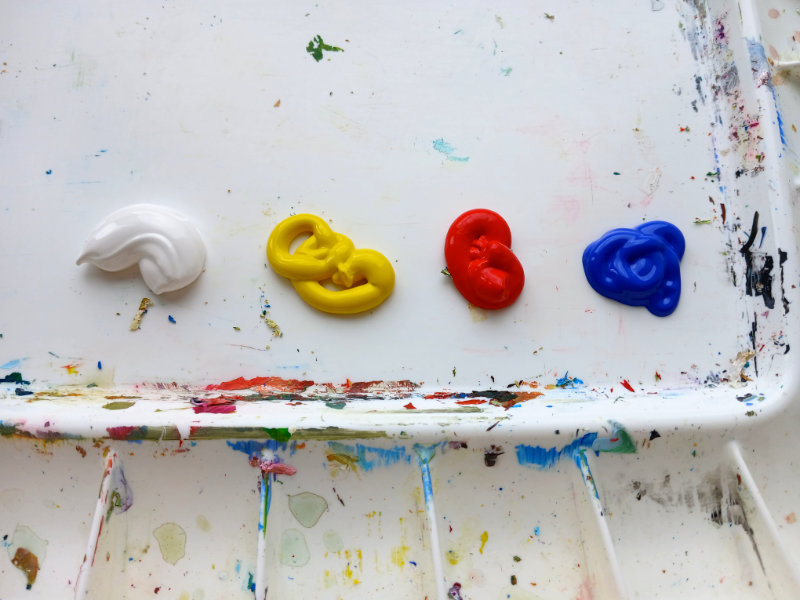
I’m using Daler-Rowney acrylic paints in Titanium White (pronounced per Bob Ross pronunciation), Lemon Yellow, Brilliant Red and Ultramarine Blue.
Unless I’m painting watercolours, I like to use acrylic paint because it dries fast and has staying power. These particular Daler-Rowney paints were thick and mixed well so were a pleasure to work with.
The first layer of paint
There was an element of mindfulness painting as I applied these first few layers of paint. I focussed on the sensation of brushing the paint across the paper and allowed myself to enjoy the process.
Here’s me applying the Titanium White to Seaweed with a ProArte Polar 1/4″ flat brush. There’s something more mindful about using a flat brush (for me, anyway). I often prefer the results I can get with a flat paintbrush versus a round paintbrush.
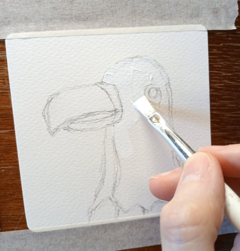
While I was creating my bird portrait paintings, I was less bothered about trying to make the paint too smooth or neat. I just tried to keep things simple and understated.
Adding more colours
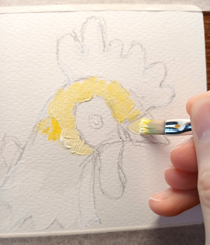
I applied the colours across all five acrylic paintings in stages. Building up layers of paint one colour at a time starting with the lightest. And so after I’d applied the main white layers, I mixed some pale yellows.
Here’s me applying a mixed yellow to Clucky:
And then followed some darker yellows, oranges, reds, browns etc. These are the bird portrait paintings at various stages:
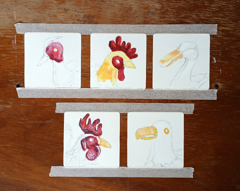
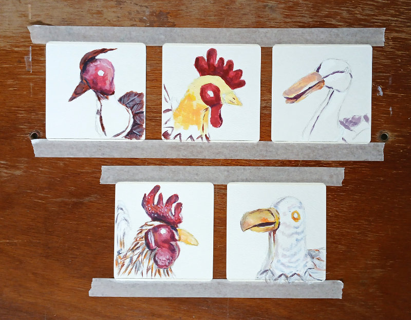
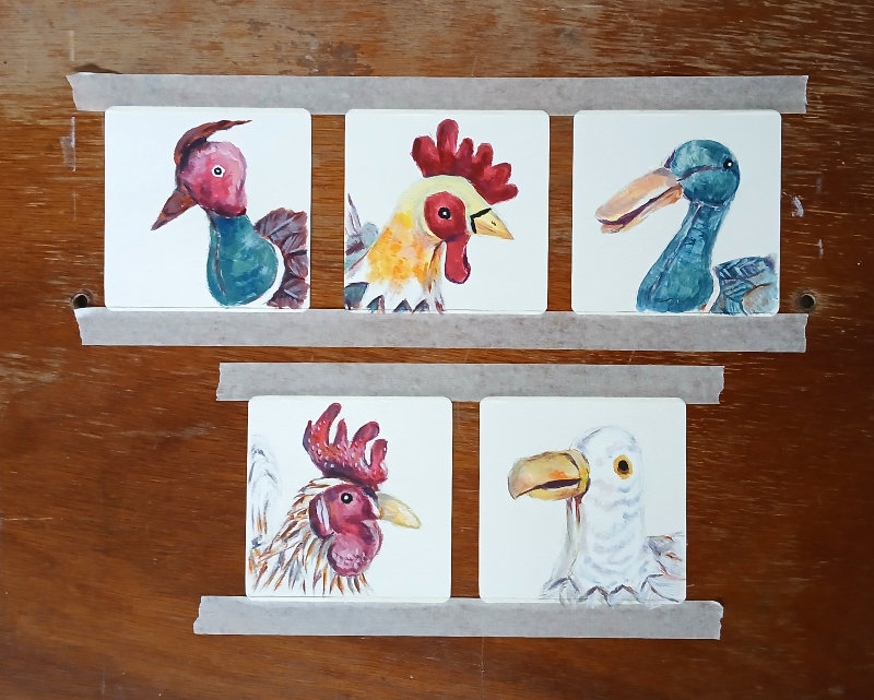
Bird Portrait Paintings
And these are the finished acrylic paintings. I was keen not to overwork them. I like how I’ve captured their individual personalities. They’re so cute. Hopefully, you like them too:
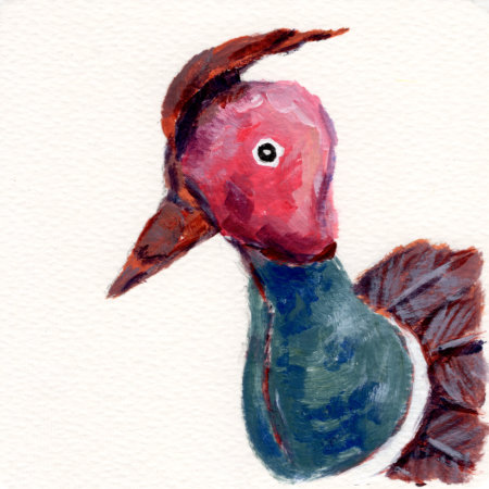
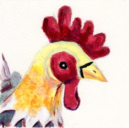
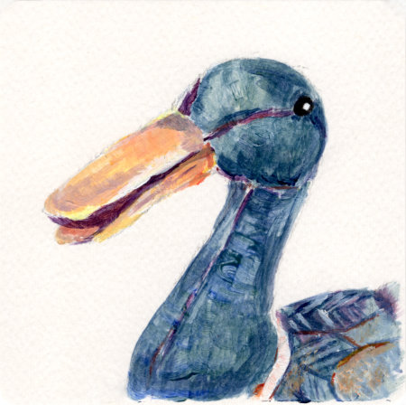
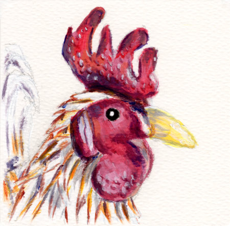
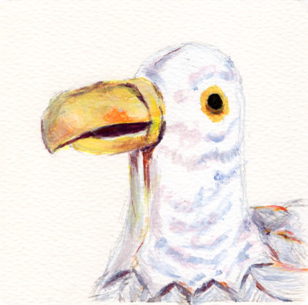
I even framed these paintings to go on the wall. Check out my birdy wall art!
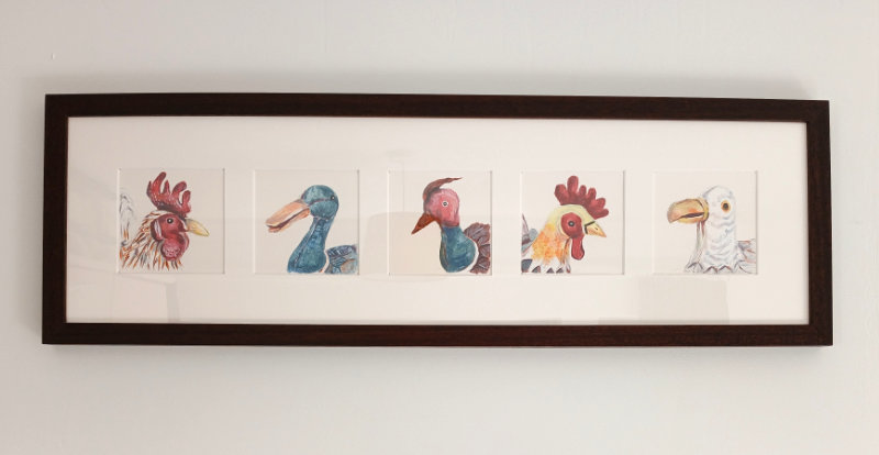
I might make these into greetings cards one day, and art prints to sell on my website so watch this space if you’re interested.
That’s all I’ve got for now.
Take care, lovely blog reader.