
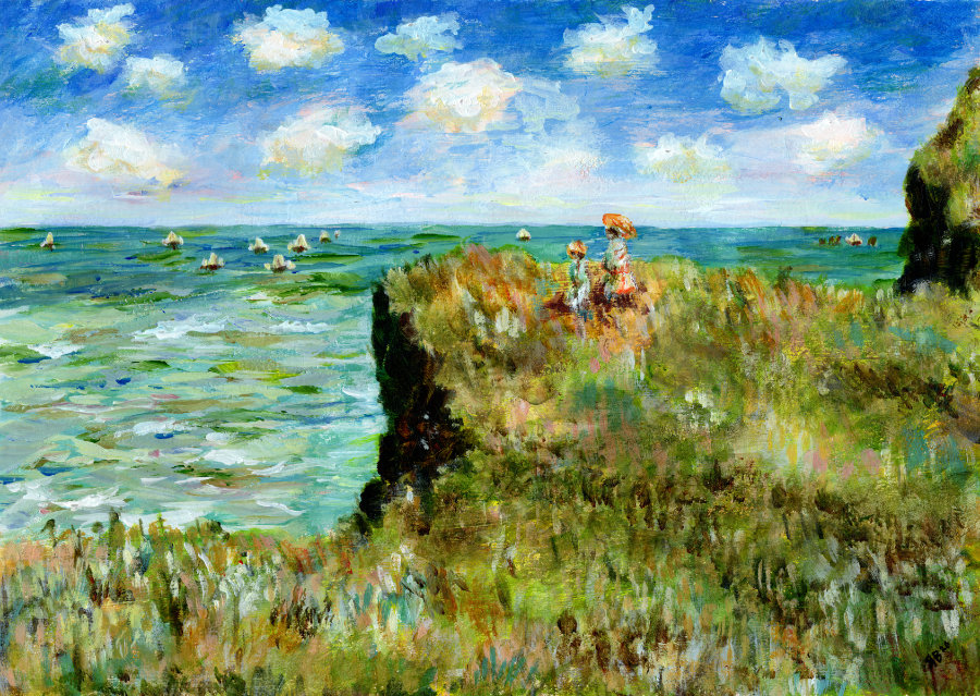
I recently discovered the painting “Cliff Walk at Pourville” by French Impressionist painter Claude Monet and was immediately drawn to it. We’ve been enjoying a heatwave here in the UK and so I’ve been wanting to paint something summery. In particular, I’ve been searching for summer-inspired Impressionist paintings and that’s how I stumbled across Monet’s beautiful landscape. For me, this painting evokes a strong sense of summer. It’s the blue skies and ocean view; the colours remind me of old holiday photos. It’s such a light and airy painting, I can almost feel the hazy summer sun beating down. Perfect inspiration for heatwave art. I decided to make a few studies before attempting my own version of the painting.
Cliff Walk at Pourville – A Brief Overview
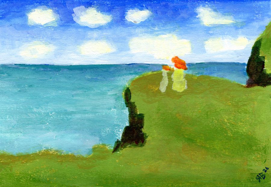
Monet painted “Cliff Walk at Pourville” in 1882. This painting is just one in a series of landscapes painted by Monet at Pourville-sur-Mer, a former fishing village in Normandy, France. It currently resides at the Art Institute of Chicago.
The painting depicts two figures standing on a clifftop, which overlooks the sea. There are fishing boats in the distance and clouds scattered in the sky.
There is some debate about the figures in the picture, some believe them to be Marthe and Blanche Hoschedé – daughters of Alice Hoschedé, Monet’s second wife whom he married in 1892. Alternatively, one of the figures could be Alice herself. It seems likely that whoever they were, they were personally connected to Monet in some way or other.
In terms of subject matter, some theorise that Monet is purposefully contrasting leisure (the two figures on a summer stroll) with work (the fishing boats labouring in the water). This is certainly plausible – painters of Impressionism often liked to depict both subjects. Leisure in particular. And maybe Monet emphasises this social shift towards leisure activities by placing that in the foreground, with the more traditional subjects of working life drifting into the background.
But right now, as far as I’m concerned, in this blazing heatwave, all this speculation is of little importance to me. My brain is far too melty to think about ‘who’ or ‘why’. I’m enjoying this painting for its colours and composition, and ‘how’ it makes me feel summery.
Evoking summer vibes through light, movement and colour
Let’s explore the ‘how’ a bit more then.
Monet uses a soft, yet vibrant palette to create bright sunlight. The colours are not harsh or invasive; the fresh summer greens and turquoise blues invite relaxation and serenity. The sky, sea and clifftop roughly take up around a third of the composition each, with the land ever so slightly dominating by the addition of the two figures. Yet, the eyes are still drawn from the two figures to the sea, to the sky, back to the clifftop again.
There is a suggestion of a slight breeze from the flowing dresses of the two figures, and the movement in the sea. Monet accentuates this through his brushstrokes which create a sense that the wildflowers are swaying in the foreground.
Warmth is added through the golden, perhaps even sun-scorched grasses on the clifftop.
It is an uplifting painting.
Getting familiar with the painting
The first thing I wanted to do was to get familiar with the composition. And I did this by simplifying the shapes and colours – just blocking in the main structure. I’m ignoring the detail and effectively reducing the painting to large value and colour masses.
This is what that looked like:
I used acrylic paints for all my studies of Monet’s “Cliff Walk at Pourville”. And I’ve never known acrylic paint to dry so fast. I’m talking a couple of minutes – the paint was actually drying on the palette before I’d had time to use it. That’s how balmy it has been here in the UK. Seriously, for those artists in hotter climates – how do you do it? Do you use mediums to slow down the drying time?
Anyway, I felt much more familiar with the painting after quickly sketching this out.
The simplified painting loses the fishing boats in the background, as well as the variation in the grasses and wildflowers. The figures are reduced to simple two-colour shapes, and the sea loses its momentum and becomes ‘calm’. So that’s interesting already actually – it further emphasises that the movement comes from the mix of colours and the brushstrokes.
What remained the same was the division of the sky, sea and clifftop into rough thirds, as you’d expect. The figures as the main focal point is highlighted, and I think the shadows of the cliff edges become more dominant.
Monet’s use of colour in Cliff Walk at Pourville
To continue familiarising myself with Monet’s summer-themed painting, I decided to pick out my top ten colours. This is something I like to do when I’m studying a masterpiece as I’m often surprised by the results, e.g. see my previous Monet blog.
And this was no different.
These are the colours that stand out to me the most:
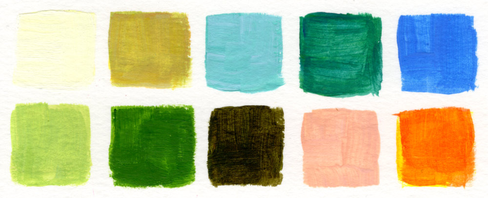
What strikes me is that they aren’t ‘overly’ summery. I’m usually drawn to paintings that have warm yellows and oranges, yet this palette is cooler and softer. Which means that I probably need to learn to become more confident using other colours. I’m learning that it is more about how the colours combine and interact that determine the emotional response.
Experimenting with brushwork
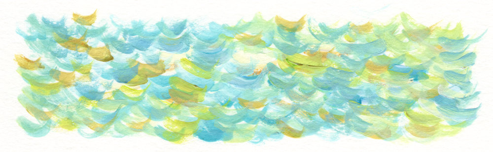
By this point I was keen to have a go at my own tribute to “Cliff Walk at Pourville”. However, I wasn’t quite sure how I was going to tackle the sea. So I decided to practice first, and I’m glad I did – I explored three different methods.
My first attempt was to create the movement in the sea with fairly consistent and curly brushstrokes. It looked interesting, but not what I was going for (although, this technique would make for a nice mindfulness art practice):
Next, I decided to lay down a turquoise background and paint some scribbly lines over the top.
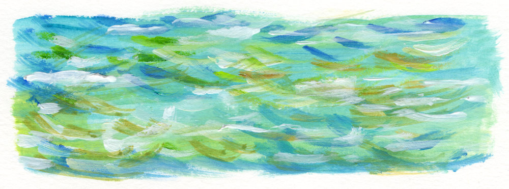
I felt like I was getting closer, but the scribbles were too uniform and the colours were too equal in value.
For my third practice, I still used a background colour first but I made it more subtle. Then I made my brushstrokes over the top more varied in both colour and shape.
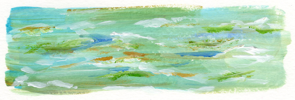
I was happy to proceed on this method.
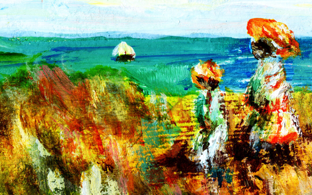
Ruth Burton’s Cliff Walk at Pourville after Claude Monet
To start with, I painted a pale red-orange-pink background. That was mainly just to get rid of the blank white page fear – but it does shine through in parts, which creates a nice contrast to the blues and greens.
After that, I worked on the sky and the clouds. Clouds are quite fun to paint, but I had to look out the window at the real-time clouds for some inspiration. Definitely something I can improve on, so I think I might practice clouds in a future blog post.
While I was painting the sea, I kept reminding myself not to overwork sections (something I’ve done in the past). So I had to resist the need to add little details and instead keep it loose.
I was fearful of attempting the grass and wildflowers in the foreground so I procrastinated by doing the dishes and then the ironing.
After half an hour of violin practice, I applied a very light, messy wash of greens, browns and beiges. At least now I had something for the clifftop. Then I just kind of dabbed around with lots of different colours until it looked acceptable. It’s definitely the weakest area in my opinion, but I think the fact that I’m working on an A4-sized page doesn’t help. I think if I used the same brushes and techniques on a larger piece of paper or canvas then the result would be more successful.
Finally, I added the two figures – which I think are my favourite bit.
And here it is, my version of “Cliff Walk at Pourville” after Monet:
On the whole, I’m really pleased with how this turned out – I can tell because I keep looking at it.
Until next time
Impressionism really lends itself to expressing the different seasons, so I hope you enjoyed my exploration of Impressionist summer. My thanks to Claude Monet for the inspiration, and to the sun for being warm.
Fingers crossed this sunny weather lasts a bit longer.
Take care and speak soon.