
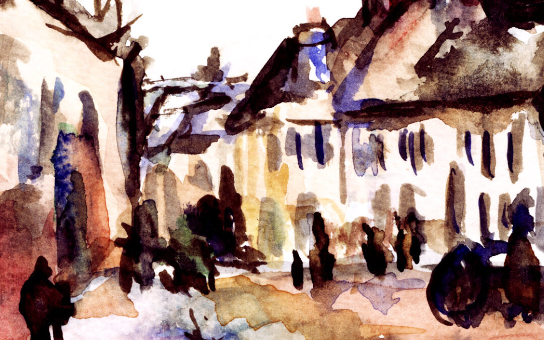
“Pontoise, the Road to Gisors in Winter” was painted in 1873 by Camille Pissarro (1830-1903), a Danish-French painter and leading figure in the Impressionist movement. I’ve decided to focus on this painting after recently attending another fascinating art webinar which centred around the Impressionist paintings at The Museum of Fine Arts Boston (where the painting resides). I was immediately drawn to it. Also, the cold weather has definitely arrived here in the UK; and so my current art inspiration has turned to winter-related things. The following is my study of this beautiful painting.
Let’s get to know Pissarro
Camille Pissarro is a popular painter of the Impressionism and Post-Impressionism art movements. He primarily painted landscapes and rural scenes, and they are very satisfying to look at. There’s something very clean and inviting about his brushstrokes and use of colour that makes me feel all fuzzy and warm.
Pissarro was a decade older than the likes of Monet and Renoir, and as such was often seen as a mentor to the other Impressionist painters. Well-respected and keen to provide encouragement, I believe he was an all-round nice guy.
Pissarro was born on the island of St Thomas (part of the Danish West Indies at the time). As a young adult he spent a couple of years in Venezuela with his friend Fritz Melbye, another Danish painter, but eventually ended up living in France. First in Pontoise, then in Eragny-sur-Epte.
Unfortunately, his life story follows the archetypical struggling artist, and he lived in poverty. But his devotion to art and painting did not falter, and his lifetime portfolio exceeds 1,500 paintings. At the time of writing, the highest recorded price paid for a Pissarro was nearly £20 million in 2014 (for “Le Boulevard de Montmartre, Matinée de Printemps”). Typical.
“Pontoise, the Road to Gisors in Winter”
For me, this painting evokes feelings of a cold winter day. I love the muted, cardboard-box colours and the suggestion of snow on the roofs. If I remember correctly, I recall someone in the webinar noting how he has captured that ‘snowy’ winter sky perfectly – I agree.
The colours are very neutral and cold, which are ideal for the subject matter. The cool grey and beige tones convey a sense of winter. I’m not a fan of the cold (understatement of the year), yet there is something quite comforting in the colour palette that Pissarro has chosen. And there are some hidden colours to be found – more on that in a little bit.
The composition draws our eyes to the figures on the street, starting with those on the right, and then leading us across to the left to those in the distance. To me, it feels like this road is on an incline and slopes downward, presumably towards Gisors.
Pissarro uses ‘Impressionist-style’ brushstrokes to create texture. By that I mean that the brushstrokes are visible and unblended – in contrast to a more traditional, classical painting technique. This is most apparent on the road in the foreground, and on the roofs. This loose, daubed-on way of painting is a characteristic of Impressionism that I am particularly fond of. It makes paintings more dynamic and exciting, in my opinion.
A watercolour study
After looking at Pissarro’s painting for a good long while, I felt like having a go at recreating it in watercolours. It has ended up as a cute little sketch, but something that I quite like.
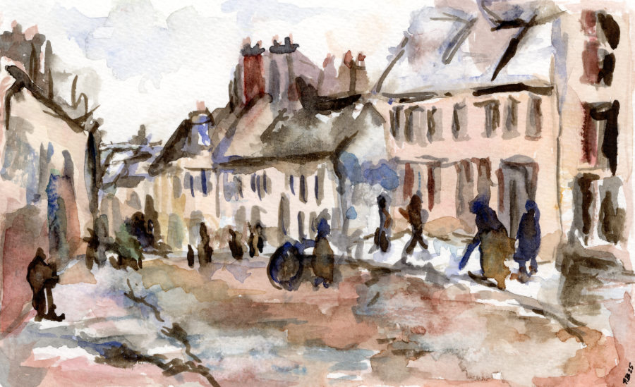
I’m not used to painting with such subdued colours. I kept having to remind myself to mix in some browns and greys to dull the vibrancy of my watercolours.
That being said, there are some pockets of colour that shine through, and I wanted to capture these points. Here are the main colours which I used, and as you can see it looks more colourful than on first glance (a bit like when I did this exercise on one of Van Gogh’s ‘Sunflower’ paintings). There is almost a muted rainbow of colours in there.

Something quite clever is going on in Pissarro’s painting. If you look closely at the original, he marks out the points of a triangle in red, blue and green. The red of the chimney joins to a splash of blue just to the right of the centre, with the third point being the ultimate focal point of the painting – the green umbrella carried by one of the figures in the distance. How pleasing. Another subtle technique to draw the viewer’s attention from right to left.
And what is the significance of Pissarro using green at the focal point? My own interpretation is that this alludes to some seasonal warmth to follow. Greens are relied on for paintings of spring and summer. Seeing green in a winter scene gives us some hope – to look forward to warmer times, maybe? Or maybe I’m just saying that because I’m cold… wishful thinking! Your different interpretations are welcome!
Paint because you want to paint
“I regard it as a waste of time to think only of selling: one forgets one’s art and exaggerates one’s value.”
The above is a quote from Camille Pissarro, and I like it. In modern-day nomenclature, this could easily describe mindfulness art. Essentially, focus on the art when you’re making the art. Don’t focus on the end result, the sales, the ego. The art created in a state of mindfulness will have inherent beauty. When I look at “Pontoise, the Road to Gisors in Winter”, I see that beauty.
Take care, lovely readers, and be kind.