
This month I set myself a watercolour challenge. I came up with the idea while I was out on a walk in nature – quite spontaneously, really. It sounded fun (and turned out to be). The idea was to paint a scene with a limited colour palette. Just four colours to start with. Then, I would paint the same scene three more times, each time removing a colour from the already limited palette. So by the time I’m on the fourth iteration, I’m down to just one colour. I’ve done a similar exercise before with my acrylic painting. See one of my earlier blog posts – Sunflower Painting Inspired by Vincent van Gogh – where I paint using a limited colour palette. I must like the challenge. And this time, it’s a watercolour challenge!
The Scene
I am using a reference photograph which was taken on a visit to the Black Country Living Museum in Dudley. By the way, I would recommend visiting if you’re looking for a fun day out.
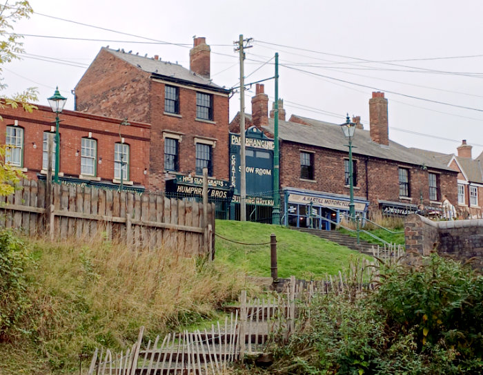
I’m drawn to the interesting composition. I think the viewpoint, taken from downhill, turns it into something quite special. And I like the streetlamps, the steps, and the rickety old fence. It’s an inspiring scene to paint.
Art Materials Used
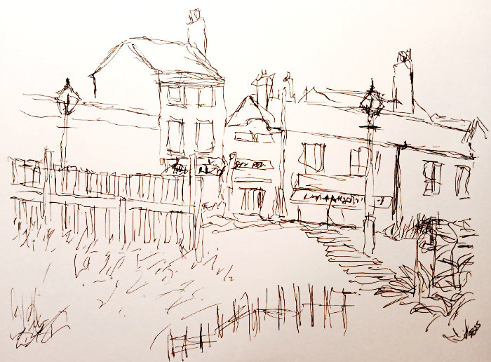
For all four paintings, I used a 0.1mm Uni Pin Fineliner pen to create an ‘urban sketch’ style drawing. These pens are water resistant and the ink dries fast. They are ideal to paint over with watercolours. Note: you can paint first, let it dry, then go over with the pens if that’s your style – that works too.
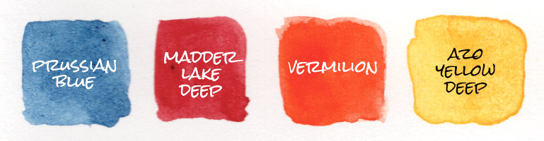
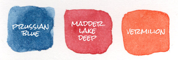
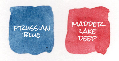
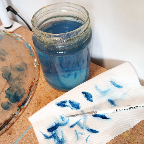
The paints I’m using are my trusty Royal Talens Van Gogh watercolours. And the colours I have chosen to start my watercolour challenge are: Prussian Blue, Madder Lake Deep, Vermilion and Azo Yellow Deep.
I’m using Daler-Rowney Aquafine Hot Pressed watercolour paper. I don’t often paint on Hot Pressed watercolour paper because I prefer the texture of Cold Pressed (aka. NOT) but I thought I’d give it a try. And I was pleasantly surprised; it was very nice to paint on.
The Watercolour Challenge
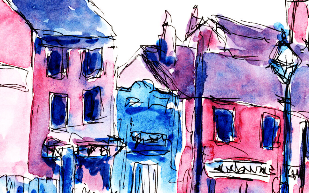
For my first painting, I used all four colours: Prussian Blue, Madder Lake Deep, Vermilion and Azo Yellow Deep. Possibly slightly overworked this painting but I still like it:
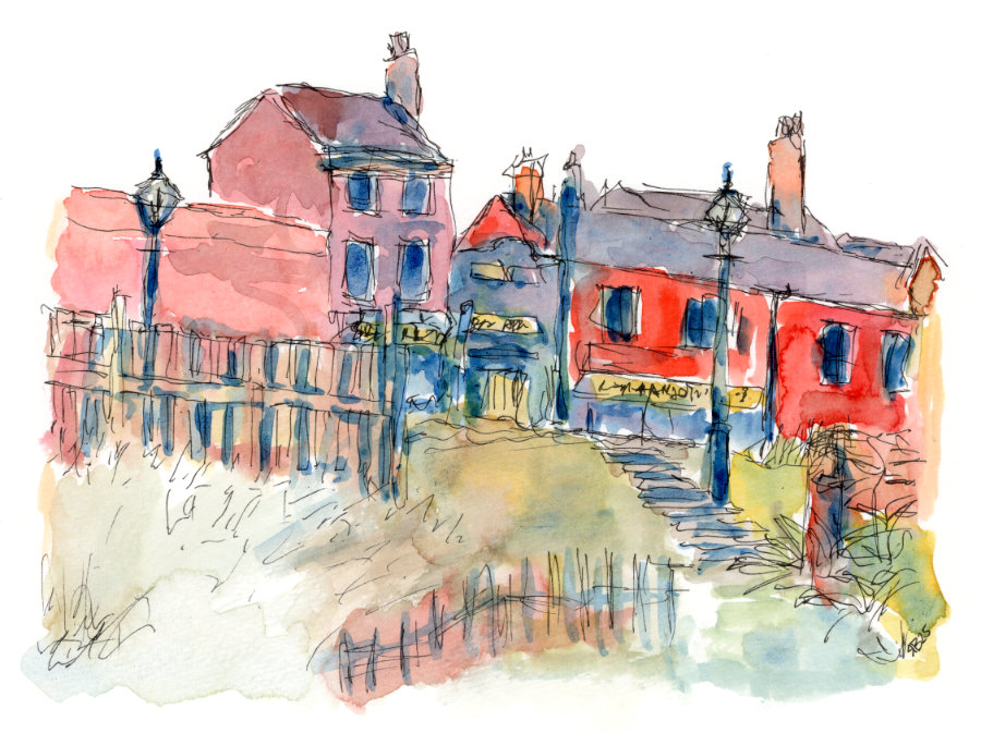
Because I just about have the primary colours (a red, a blue, and a yellow), I can mix almost all the colours. So while this is still a limited colour palette, it would allow for the most realistic representation. In theory. My painting is kind of quirky and unrealistic though.
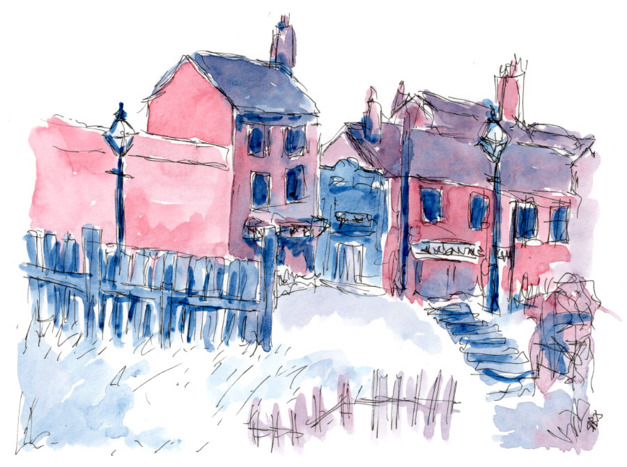
For the second painting, I used three colours: Prussian Blue, Madder Lake Deep and Vermilion. This was particularly challenging to me because I rely on using yellow in my paintings to add joy. It was an intentional choice for this reason. Sometimes you need to step out of your comfort zone with art.
This one is ok, I don’t mind it to be honest. Weirdly, the painting has similar vibes to actually being at the Black Country Living Museum. It’s hard to describe, you’ll just have to go.
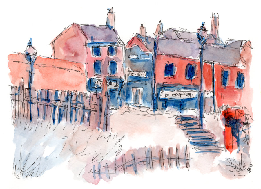
Painting number three and I’m down to just two colours: Prussian Blue and Madder Lake Deep.
Naturally you end up with purple tones, and the mood changes to something more subdued and melancholy. I think is the most successful painting of all four.
The fourth and final painting, and now I’m just down to Prussian Blue.
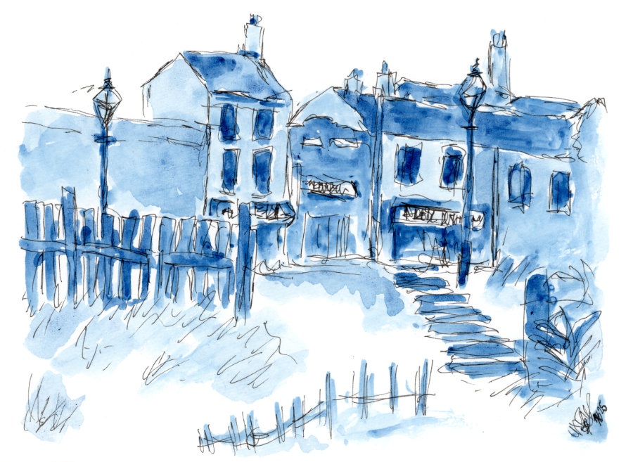
This is actually the one that I enjoyed painting the most. To the point where it makes me wonder if I should do more monotone paintings.
Things got pretty blue…
Final Thoughts
A variation on this watercolour challenge could be to remove the colours at random – pick them out a hat or something. I can see how that would be even more challenging, especially if you were left with yellow at the end! I bet that could work actually…
Or, just had another idea – paint with same the limited colour palette but on different colour backgrounds…
I’m wondering why I’m drawn to these kinds of ‘limited colour palette’ challenges. I even remember doing something similar for an acrylic painting as a teenager. Then I drifted away from that and went through a phase of throwing every colour possible at a painting. And while that can work, I rarely felt satisfied with the result. By limiting the colours, I think it results in a more cohesive and successful painting. And it requires more consideration in the moment, so maybe that’s good – makes me think there’s a ‘mindfulness art’ practice to be found here as well.
Anyway, that’s all for now, lovely people.
Take care and look after yourself.
I’m going to go paint frogs now.